…Fit for Hamilton
After finally watching Hamilton, I’ve decided that everything should be set to music and rhyme. Here’s how Hamilton might manage the Federalist papers:
(🎶 Twenty twenty-one
At a desk 🎶)
 I've got to track my data,
my IP, and my essays.
Sure, I write too quickly,
That is what they all say.
 I track it in this system,
a product made by Claris.
It's my tool of choice,
FileMaker Pro, but there is

Not enough time for me to waste time
I've gotta take my shot
Work: there is a lot,
And sometimes I spit a rhyme.
Help me get around my system,
where I track people and states.
With a few clicks on this trackpad,
I want to easily navigate.
I’ll save you from any more of my rap skills and get to it (and if you’re a fan, shoot me an email, and I’ll send you a rap: FREE).
Somewhat like going to a Broadway show and expecting to see chairs organized into rows, centralized navigation isn’t often an explicit feature request, but every user expects to see it. Central navigation is an overarching menu (or button/tab) system where you can go from anywhere to anywhere within software, regardless of context. Another kind of navigation is specialized – where you link directly to a specific element in your solution.
This post explores a technique for building a data-driven, hierarchical navigation menu that will level up (think Mario one up mushroom… ding!) your apps in ways that are both intuitive for users, and quite slick for us FileMaker nerds.
So what are the goals?
- To give users an easy, intuitive way to navigate around the solution without hunting around
- To show users just enough without overwhelming them
- To provide users with something that feels familiar from websites
- To not surprise or confuse the user
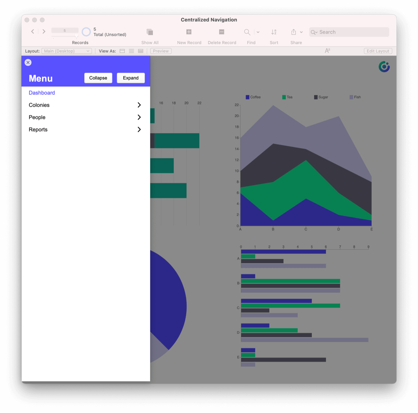
Let me start with the final product so I can deconstruct it with a visual in your mind. Here are screenshots of a navigation card both collapsed and expanded: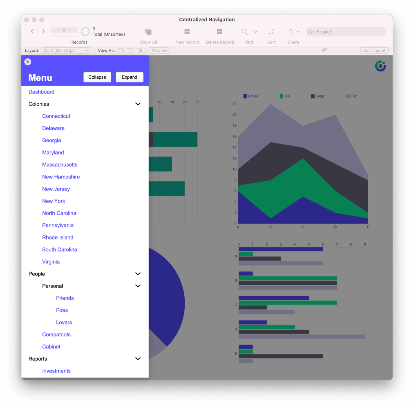
And here’s a quick video showing you the functionality:
One of the key benefits to this technique is that your navigation menu is driven by data – you won’t be adding each menu choice by hand. What you’re looking at is a List view in a card window.
So, what are the parts to make this happen?
- A table called Navigation, which contains one record per navigation option
- A table called NavVL, which is a virtual list (more about this later)
- A layout suited to be a card window, based on the NavVL table occurrence (TO)
- Scripts to:
- populate the virtual list
- allow a user to collapse or expand one or more nested navigation options
- do something when a user clicks an actionable navigation open (like go to a layout or run a script or show a report)
Setting Up the Tables
The Navigation table will be the keystone to make this all work. By having a data-driven navigation system (based on records), you’ll have a flexible way to add, remove, and edit options as your system evolves. If you add a new layout, you can add a new record to your Navigation table and you’re done! The tool is flexible as well – you can add reports, processes, and nearly anything that would otherwise be driven by a button.
In the navigation table, we’ve got a few fields that are important to make this work.
- A name field, which is what the user will see in the navigation
- A sort field that defines the hierarchy and is manually entered
- A calculated, indented display name, to make the hierarchy obvious to the user
- A parameter field that will tell the navigation script what to do when a user clicks on a given row
- A parent field that calculates the sort of the current row’s parent in the hierarchy (e.g., 001 is the parent for both 001-001 and 001-002) which is used in the script to collapse and expand hierarchical menu options
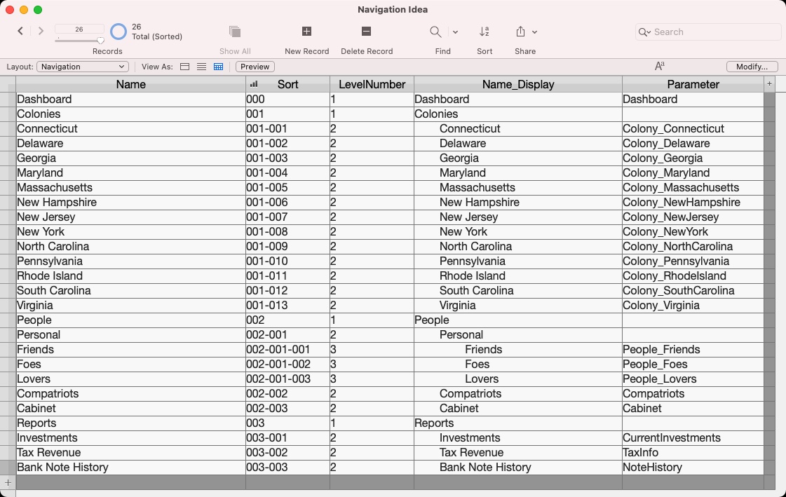
The screenshot above shows how the sort field uses dashes to define the hierarchy. If something is at the first level, it will be a three-digit number. For every level above that, you’ll see a dash before the next three-digit number. We’re using this so we can sort alphabetically by that sort field.
All about Flexibility
The NavVL table is a virtual list, which means the data isn’t stored within the table. Instead, the data comes from another source – in this case a global variable which is set when the main navigation script is run. It mimics much of what the Navigation table has. So why two tables that are so similar? Flexibility.
Since the virtual list table (NavVL) is populated based on a global variable ($$navigation), you can choose what appears in that global variable. Imagine only wanting certain menu choices depending on the user or the user’s job role. Since a script sets the global variable, you can control what shows up in that navigation at any given point. You can choose to limit what shows up based on user, privilege set, layout context, and so much more. And because the table is a virtual list and based off of a global variable stored in local memory, interacting with the table is fast.
Creating the Card Window
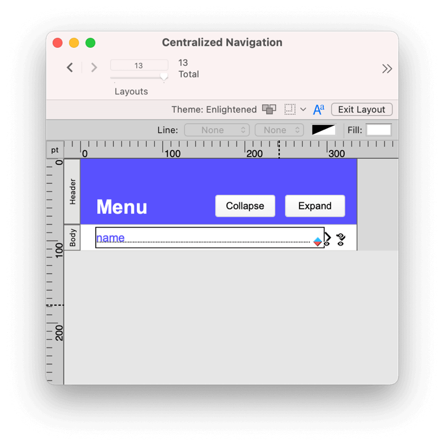
The Navigation Card layout is sized to show up on the right or left side of the screen (tall and skinny). The context of the layout is the NavVL table – the virtual list. You’ll see the name field on the layout, and that’s based on the display field in the Navigation table, which shows the hierarchy with indents.
Considering the data can be nested (multiple levels of hierarchy), it’s helpful to have arrows to show if a menu is open or not. It’s a visual cue that tells you if there is a submenu and if that submenu is visible. The layout also has a button that will do one of three things:
- Expand a menu with submenus
- Collapse a menu with submenus
- Complete an action for an option that doesn’t have a submenu (by passing the parameter to the script)
Now the Fun Part: Scripting!
First, you’ll populate the virtual list and open your card window with the correct found set.
In order to efficiently gather a return delimited list of values for the virtual list, I chose to use ExecuteSQL to collect the data. The $$navigation global field is populated based on the SELECT statement — GFN() and GTN() are custom functions included in the demo file and protect this calculation from breaking if the referenced fields or table occurrences are renamed.
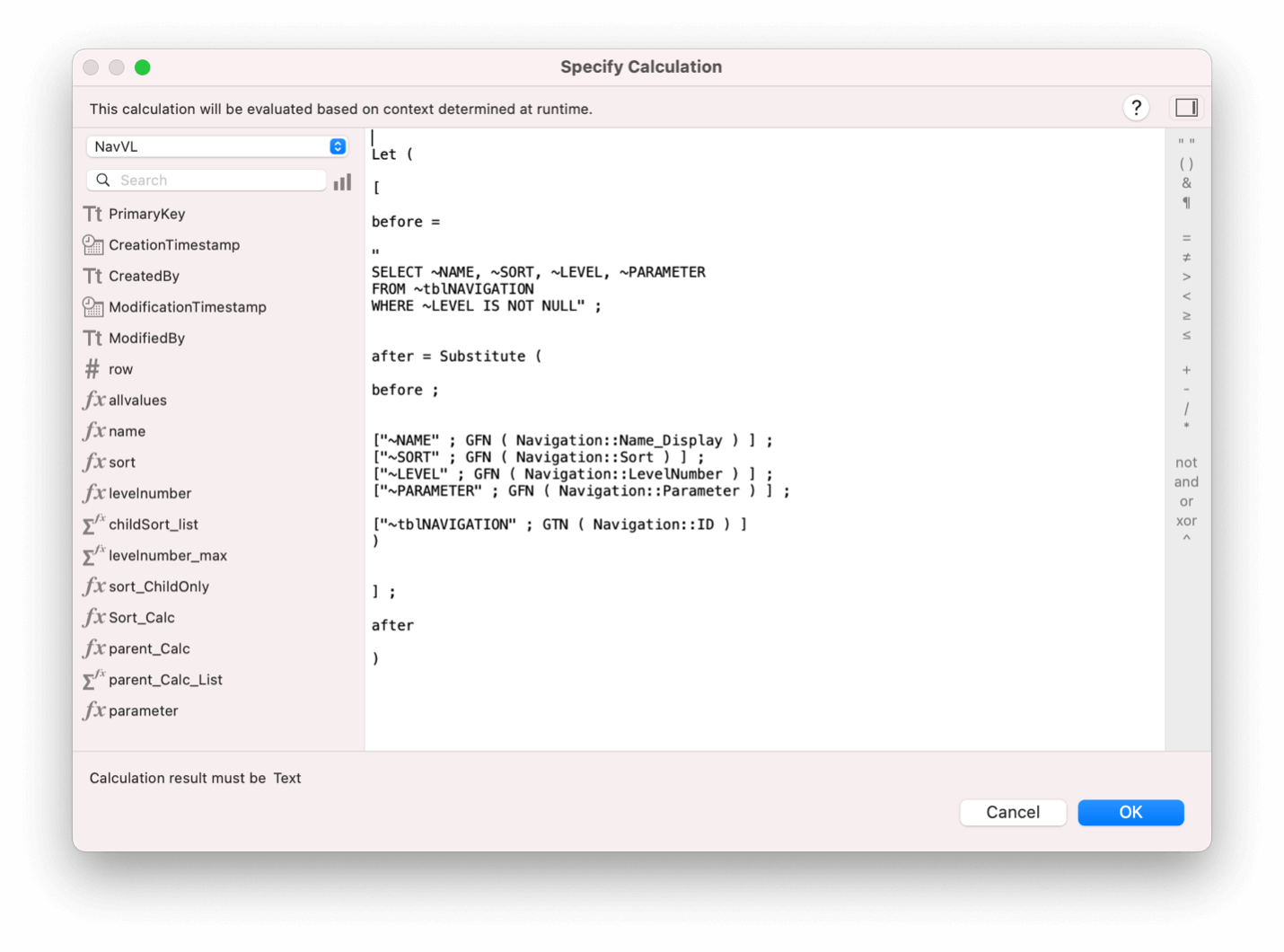 With the virtual list populated, we’re using a combination of global variables and native finds to make sure the correct virtual list records are showing. And no matter what, we sort by the sort field to make sure the hierarchy is grouped properly. For example:
- To expand all menus, show all records that are populated in the virtual list.
- To collapse all menus, show only records where the level is equal to “1”.
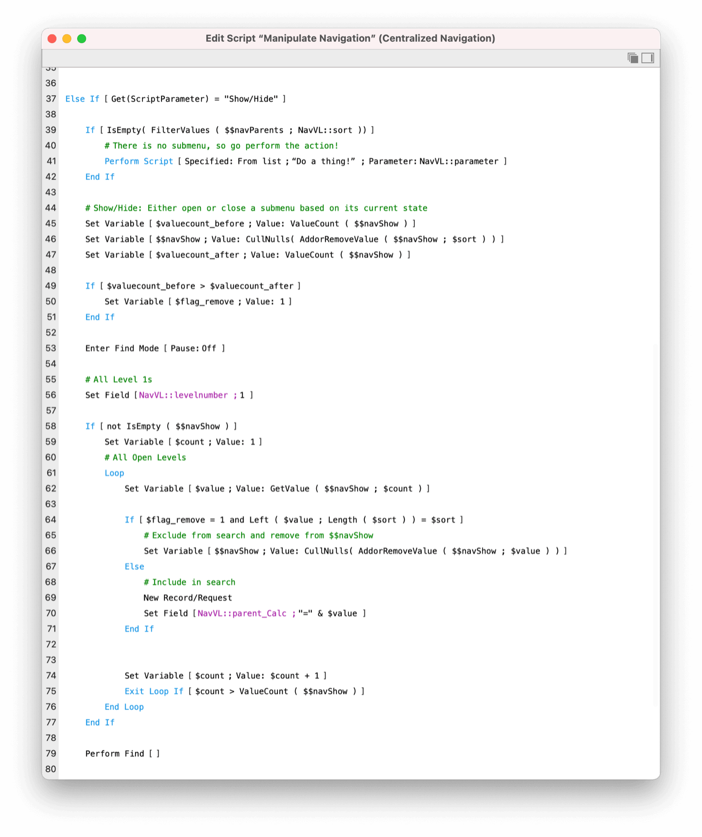
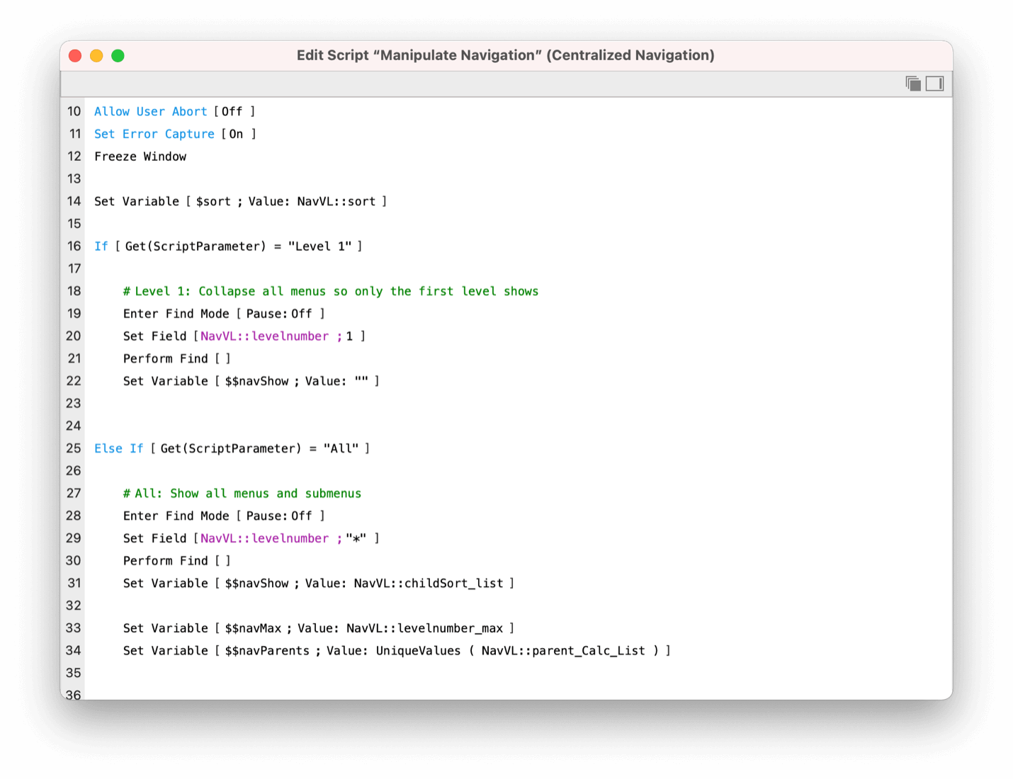 Things are a little messier when deal with the individual menus. In short, we need to explicitly say which menus we want to show (note that level 1 options ALWAYS show).
To expand a single menu, we explicitly call out that sort number and place it in the $$navShow global variable. From there, we perform a find where we look for any virtual list record where the Parent_Calc equals that sort number.
Here’s an example: Assume the parent menu is sort number 001, and its children are 001-001, 001-002, and 001-003. To show those children, clicking on 001 will:
- add 001 to $$navShow, and
- in Find mode, look for “001” in the Parent_Calc field.
Note that if 001-002 has its own children (say, 001-002-001, 001-002-002, 001-002-003) it won’t automatically open those up. That’s because the scripts makes sure to look for an exact match of “001” as the Parent Calc.
Is this worth the effort?
Totally! In many cases, having flexible navigation can enhance your solution. You can add new navigation options by adding records to a table. You can use if statements to run different subscripts when a user clicks on any given menu item, and your users will intuitively know how to navigate around an interface like this. Since this technique uses a virtual list, you can easily load only the menu options that apply to a given user or the current layout.
A little bit of effort can go a long way! Grab what you can from this demo file and apply it to your own solution. You’ll have a flexible navigation system that will be easy to modify as your solution grows!
To access other Technical blog posts click here.
Comments
Leave a comment
Built with you in mind
Speak to one of our expert consultants about making sense of your data today. During
this free consultation, we'll address your questions, learn more about your business, and
make some immediate recommendations.


Hello,
I saw your demo on designing an accordion menu. Really interesting and very well designed. This is exactly the type of flexibility I’m looking for. Is it possible to get the demo?
thank you very much
Hi Ray! The demo file is available if enter your contact information in the form at the bottom of the page. Let us know if you have any trouble.